Sunday 31 August 2014

FIFTH DECADE ....

 
By golly its all excitement around here!  I have a new journal and I'm LOVING working it in - its another spiral bound book and approx 10 x 10" square.  I've filled 8 A5 ones so far, and it was a big step to branch out from those, so forgive me if this seems like a small thing to get excited about, but I am!  The extra space of the square format allows so much more possibility.

For those who like to know such things its a Pink Pig journal and the paper is a really nice quality - although I am still sticking two pages together as I like them to be nice and strong for anything I may throw at them, and don't want any bleed through.

You can see below what nice effects I got on this new paper (gessoed first) with my Neocolour II crayons - I never got subtle watercolour type results like this before.
I was so delighted that it took me a while to decide I could bear to do any work on top, but eventually I went for outlining some of the "layers" and doodling in the spaces.  This was done using Pitt Artist pens which write pretty well over the crayon - except if its laid on too thick when it gets a bit waxy.  However I now have a secret weapon to combat this problem in the form of a black Posca paint pen, which writes superbly over absolutely anything!  Its not as fine a nib as some others you can get, but its great for doodling and drawing.  The white and greeny blue are also Posca colours - I have a selection of these in medium and in the finer 0.7.  The colour range is sadly much better in the bigger chunky nibs (why?) but I have fun even with the limited choice of 10-12 colours, and particularly like their opacity.  If I want see through colours I go with my Promarkers.
The page was then left like this for over a week because I was so delighted with it that I didn't want to ruin it, but in the end a journal page isn't one (for me anyway) unless it has words on it, and these are what popped out of the far recesses of my brain.
So as you can see, I'm not at all troubled by the fact that I shall be 60 next week - my fifties have been absolutely fabulous (painful illness notwithstanding) and I hope my next decade will see me grow as an artist as much or more than I have in this one.  We shall see!!

Saturday 23 August 2014

ITS NO GOOD ...

 
This is me doing self-therapy again!  Because its difficult for me as a disabled person to get out of the house unless I have help (ie somebody takes me) I do spend rather a lot of time at home ... albeit mostly contentedly occupied in my studio making stuff.  But while I can stand a lot of my own company (especially when I've got Radio 4 on) I'm also a social sort of person and if it weren't for online groups and art communities I might have gone quietly bonkers by now, and its got to be said that I do get lonely at times for "real" people and conversations.  However, I  sincerely thank heaven for the internet, because without it my limited life would be a whole lot more  impoverished!

But there are times when I think ... what can I do to get out there, or find artsy people who like me have their days free, so that I can go out and meet them, or invite them here for mutually satisfying artistic encounters and exchanges of skills etc etc.  So that's what was on my mind during the making of this page: the background below is my usual Neocolour II crayons, but laid down before I discovered just how much more intense the colours become on a gesso base.  The glasses thingy (it must have a name but I'm blowed if I know what it is) is a stamp I've had for some time and never managed to use before!
So there I was, talking to myself and God bothering all at the same time, when it came to me that it was up to ME to do something about it.  By the way, the light bulb is another stamp, a hand carved one bought from Etsy, and telling myself "its not Facebook friends you need (nice as they are) but a few more real ones". Anyway, having written all that down, out came the collage sheets to beautify it - lots of Teesha Moore images here.
And then I drew the doodly seams and strata - for me they kind of represent the complex layers that go to make up a life, any life not just mine.  I like drawing and decorating these, especially because they start with wobbly lines, and in all the doubt and self questioning I was doing wobbly felt about right!!
So did I get out there and change my life into a giddy social whirl?  Nope, but I thought about it a lot and the conclusion I've finally come to is that, although I love the art journalling groups on Facebook, if I want to attend a real life one I'll probably have to start it!  So how about it - are any of you nice kind followers based in the north of England within reach of Preston?  It really only needs a handful of us to make it work - I've got the table if you want to come and sit around it!!  OK I'll settle for one or two ... just make yourselves known and I'll put the kettle on .....

Saturday 16 August 2014

FLY AWAY ...

  
I've always said art journalling is therapy, and that's particularly true for me as I often work out my negative feelings in these pages.  That's what was happening here when I just felt tired and overwhelmed by all the things that were going on, none of which seemed madly urgent or important at the time, let alone deserving of my limited energy. OK, its entirely possible that there was an element of self pity going on in there as well ...

So in this less than positive mood I'd painted the page grey and added a torn off strip of paper with some rather interesting panels of paint (printed on the paper rather than put there by me).
Then I added the grey, worn out looking lady but she looked so miserable I couldn't resist giving her pink wings - bright pink is my strong brave colour.  Then of course I had to add other touches of pink, just to lift it all a bit.  The writing at the very bottom is from a Teesha Moore collage sheet, and I've learned from her to make colour copies of my own work and cut it up as collage fodder - so that's what the top left panel is.
So then of course, the thought about flying away from everything turned out to be what I wanted/needed to get down, and everything else followed.  I wrote "but stayed" before I did the other writing on the right hand side, and it ended up a bit of an orphan in terms of meaning, when disconnected from the main message.
Unsurprisingly I was much more cheerful by the time I'd finished - not to mention having got rid of a few things in quick telephone calls and the time-honoured strategy of ignoring some stuff as well.

This is a short post because I'm tired after my day trip to the Motability Show this week (by golly I know how to live the exciting life).  It was brilliant and helpful but very tiring, so am slumped in the studio doing very little more than make pretty backgrounds at the moment - seem to have run out of words!

Saturday 9 August 2014

BE YOURSELF ....

  
At the risk of sounding self-congratulatory, I am really pleased with this page!  I like the colours and the layout, I managed not to write in straight lines, the Easter Island head makes me smile, and I got down something that I'd been thinking about a lot.  Successful art journalling I believe?

Anyway, below is how the page began - I have this terrible tendency to just paint a page a single colour, so I was determined to use at least two.  Having just bought a new bottle of turquoise/teal and this glorious lime green (these are just bog standard acrylic paints) it was obvious that I would try the two colours together, having noticed how great they looked together in the car going home!
It needed a bit of shading and a touch of white too, and then I was off with the bits of collage and this wonderful image of a carved stone head I'd found from somewhere, a newspaper I think.  The collage is just bits of colour and pattern which appeal to me - something I've learned from Teesha Moore.  As soon as I added the glasses (using one of those cheapy £1 clear stamps) I knew instantly what the page was about.
So then I developed it a bit more - doodling on the collage shapes and getting the writing down.  My stone head stands for someone trying to be something they aren't, so as well as the glasses he got a beard etc. Man in disguise - geddit?  This process doesn't necessarily happen all in one session, although I don't normally work on more than one page at a time ... except when making general purpose backgrounds.
And then, my favourite part, when its almost finished but it "needs" something?  This is usually resolve through the "I know, lets doodle on it" method!  In this case with an assortment of posca paint pens, although you should note that I resisted the temptation to doodle on every single inch?  Proud of myself I was.
Like I said, I'm pleased with it and while I rarely blog my worst efforts - well I paint over the really awful ones - this one is up there with some of my favourites.  You don't have to like it obviously, but thanks for coming by anyway.
Love
Rosie X


Sunday 3 August 2014

EXPOSED ... ?

  
This page is very recent and I made it because I'd been inspired by some black and white (well shades of grey really) journals I'd seen online.  It seemed a very interesting way to work and although I didn't want to do a whole journal this way, I chose to try it out for the last page in the current one

You'll have seen my Modigliani ladies before - and not least the ones from the accidentally copied in black and white page.  I sourced the images on Google and made a collage sheet with them, which I now copy at need.  That first non colour page was a happy accident that I've had a lot of use from.

So with these ideas in mind I made a monochrome copy of another of my home-made collage sheets and used that here.  The background is a simple coat of grey acrylic paint, with borders cut from my collage sheet.  I then went on to add bits and pieces like the bunting shapes at the top, and the clock, and then of course my Modigliani lady - I'd avoided using this one because she never seemed to fit before with what I was doing ....
But once she was in place on the page - at this stage just an exercise in working monochrome - I decided she looked as exposed as I sometimes feel, and there was my subject matter!
It is my mission to be brave and fearless with myself in the journals I make - after all anything else would be pointless wouldn't it?  I then try to be equally brave about the ones I share (almost all but not quite) in the hope that this might help somebody else, or speak to them in some way.
I'm really pleased with the finished piece, although I did miss bold colours a bit, but nonetheless its an interesting way to work now and again - the grey might be particularly appropriate for difficult days or sad ones?

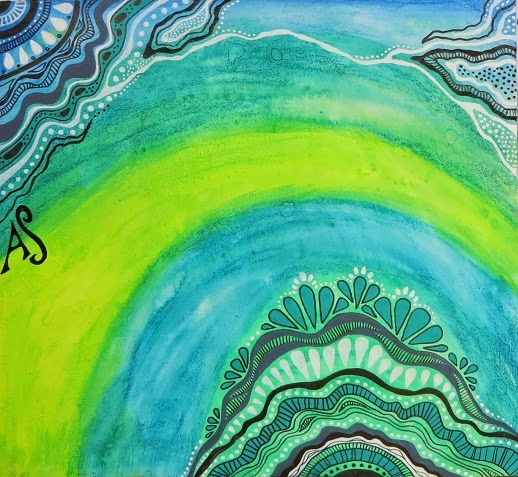
There will be a few more pages from this A5 journal to share, but at the moment I'm doing exploratory work in a new size, and loving it!  My new journal is SQUARE, which gives me just that bit more scope, and the paper is so much better quality.  Its approximately 8 x 8, so it still sits comfortably on the shelf, but the question now is whether I buy more of these or bite the bullet and try making some of my own?

And of course a number of people asked after the adopted pussycat, and the news is GOOD.  William, as we've named him, has settled in amazingly quickly.  He and Stanley are on their way to be firm friends and enjoy taking turns to chase each other around the house.  Apparently their relationship will be less combative once William is neutered - he's so very distinctively male at the moment that my beloved calls him "fluffynuts". Here's a picture of an early meeting between the boys - William is the black one.
Just noticed that the cats are also monochrome!!  What an artistic household we are ....