Saturday 31 March 2012

THE POWER OF JOURNALLING ...


I've now been making art journals (am on my 5th!) since August 2010, and am still constantly amazed by how this process can bring healing and peace, even through some pretty tough times. It seems to me that a purposeful reflection on life's events, or decisions made, in which you try to face clearly and boldly the mistakes you may have made (and I HAVE) has a powerful value in allowing you to move through and beyond the things that hold you back ......

I've been challenging myself lately to try new techniques and styles that don't necessarily come naturally - with occasionally surprising results! I tend to choose one colour and stay with it in toning shades, but I made myself pick several here - look at me combining orange and purple! And it looks nice, another lesson learned. This is all done with my trusty Caran d'Ache crayons, my favourite medium, and I've added a wiggly black line as a frame - I do that a lot, it seems to ground the page somehow?
And then I was cross with myself for one again forgetting that I could add texture, so dug out this mask that I'd never used (because I'm not sure I like it) and gave it a go, in the process managing to add deeper colour.
Another thing I sometimes forget is to use my vast array of stamps (you can never have too many, right?) and I haven't used this typewriter set nearly enough since I bought it. I also used a Paula Best stamp that hasn't had an outing lately (the face) and I can't think why because I LOVE it. You forget you've got them sometimes don't you?

I got so absorbed at that point that I totally failed to take any more stage by stage pictures, but you can see that I had a wonderful time drawing and doodling as well! About half way I realised I was writing in straight lines again, so I added the purple bit and now I love it. I seem to get stuck in a rut sometimes ... but fortunately not this time.
I love adding little doodly bits at the end - I bought a book on Zentangle and it has encouraged me to really explore the patterns and styles of doodling. What I've written here is just SO true for me - I'm a bit of a bore on the subject because it just seems to me a great discovery that could help SO many people, not just me. The best part for me is when someone else latches onto the power of art journalling and tells me how it has transformed their life - that's flippin BRILLIANT!

Monday 26 March 2012

NO SENSE OF DIRECTION?

I found this signpost image in one of mum's magazines and I just HAD to grab it for my journal (practically before she'd finished reading it), because this is something I with at times (OK a lot of the time). I do try really hard to learn from the past, enjoy the present and not worry about the future, but am better at the theory than practice so am not always very successful ... and sometimes I really need/want to be sure that I'm heading in the right general direction! When I began this page I didn't know what I would be writing on it, and as you can see below it started as an inky page with a few numbers masked off, a bit of water dropping and a bit of Tim Holtz stamping .... this crackly edge is from his Ultimate Grunge collection, which I use a LOT.
It was some days later that I joyfully plonked my sign post down on the page, and set to journalling. I have to add - woo hoo look at me not writing in straight lines below - I don't always remember that I can write wiggly, or sideways or whatever, so feel its worth celebrating when I do manage it! I'm just a straightist who is trying to loosen up ... and although I did revert briefly further down the page, I managed a bit of sideways at the end.
Not too much writing on this one, well I'd said all that was necessary, but heavy use of the white pen (Uniball Signo, totally brilliant) and some further exploration of doodling possibilities. Who knew how effect short simple lines like these could be? Got the idea out of a Zentangle book.
I was pleased with this - one of those times when the art and the journalling seemed to sort of fit together? Sometimes they don't, but what the heck - I'm keeping these journals for ME and nobody ever sees them, right??

Tuesday 20 March 2012

HE'S JUST SO SEXY ....

I'm a major fan of Stephen Fry - he's just so funny and SO knowledgeable. Yes I know he's a terrible old show-off as well, but I'm letting him off that. I have this mental list of people I'd rather like to have dinner with, and he's at the top of it - you have to admit he'd be GREAT comany? Anyway, when I found this picture of him in a weekend supplement I knew that sooner or later I'd absolutely HAVE to use it!

Unusually for me this is a painted background - I'm still trying to teach myself to love paint but it doesn't seem to come naturally. I'm also trying to be less tidy and to loosen up a bit and splodge stuff around (hence the paint), but I see I've managed to write in straight lines again and I did mean not to ...
I've never quite understand why I seem to fancy gay men, but there's no doubt that I often do - and I can't help that! I think my theory might be right - I can enjoy fancying them while knowing that they don't present any threat to me or my long marriage? Anyway, enough of that.
I add all sorts of bits that don't necessarily mean anything to this - that's me trying to loosen up and just PLAY ...
Its not remotely a typical page for me - but then that was the whole point, and I confess to enjoying making it very much. We shall have to see whether its just a flash in the pan - I suspect I'll soon go back to my neat and tidy ways! I can't help it, I grew up in a very messy house and it turned me right off and into a neat freak.

Friday 16 March 2012

SHOE FETISH? ....and a challenge?

I don't actually have a shoe fetish, more of a shoe problem as you will see. Part of my condition means that the balls and heels of my feet hurt a lot, but if I get shoes with a good thick sole (eg trainers) I can manage. Well I laughed when I saw this picture in a magazine because it exactly illustrates the tension between what I'd like to wear and the reality of what I need to wear ...
This is a Caran d'Ache crayon background - they're still my absolute favourite medium, and I am now saving up for a bigger set of colours, because 30 doesn't seem enough and 84 sounds brilliant!

I also revisited a technique I use sometimes of cutting out words from magazine (free materials!) and trying to use them to say what I mean. Then of course came the fun part of tackling the empty bits,which seemed to need filling up, and I used an Invoke Arts stamp to do the creeping tendrils or whatever they are which always makes me smile. I also added a stamp of a shoe which looks like several I own, and reminds me of ones I wore as a kid.
So (as ever) having dug out these secret longings this was an attempt to resolve them by making a page about my negative feelings. Sometimes it helps to work through them. On this occasion it didn't - my inner child is still shouting for peep toes and pink patent. Sigh.

But on a brighter note .... the picture below is the beginning of a page I was working on yesterday, when it occurred to me to issue a challenge! Are you up for it? OK well your mission, should you choose to accept it, is to make your own journal page (or indeed whatever) on the theme of "it makes me mad"!! Leave a comment with a link and we'll all have fun finding out what really gets up your nose, and you'll have the therapeutic benefit of getting it out of your system ...

Sunday 11 March 2012

A FAVOURITE POEM ...

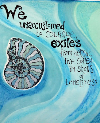
I really like the work of Maya Angelou, and this is a verse from my favourite poem of hers. There's something about writing out a poem or passage which means a lot to you, that allows you to dig even deeper into the words. That's what I was doing here .... I was thinking about the evocative phrase "coiled in shells of loneliness" and that made me get out this stamp; I've had it for ages and never get tired of the intricate shapes of the nautilus shell. Sort of proof of the existence of God, its so lovely.
This was also an opportunity to use my new(ish) metallic Promarkers. They worked beautifully here, although they're so opaque I had to be careful to work between the stamped lines (done using Staz-On) because otherwise the metallics would have obliterated them. If you click on the photos they should enlarge for you, and then you might be able to see the metallic effect more clearly.

Then it was time for the ordinary Promarkers - I still use the spirit based ones and have yet to try out the Aquamarkers because I'm not convinced I NEED them (yet). I used the chisel end to create waves of colour across the page, and somehow these blue/green shades were just right, I can't actually explain why, they speak of the sea somehow ... well not the sea around these northern shores, more like the Mediterranean.
Then I took a couple of close-up pictures for you because a few people have mentioned my lettering and I wanted to show you how I do it, and how easy it is! First of all I write the letters very simply, allowing a lot of space, then I go back and thicken each letter, as you can see below, and once that's done I often add curly fanciful bits at the ends or feet of the letters - which are not only a mixture of upper and lower case, but all different heights and widths, so no need to worry about straight lines or anything!

The observant among you may also notice that I've used my Neocolour crayons on top of the Promarkers to add shading and depth - I love how you can build up layers of colour in this way, and often use them to deepen shades in parts of the page.
I hope you can see again here how the letters are gradually built up from the first thin lines I write? Its basically a kind of doodling really, and I'd suggest you get a rough notebook or piece of paper and just have a go for yourself. If I come up with a different way of doing a particular letter I always record it in my experiments notebook. I'd also advise that you study lettering wherever you see it - that's where I got the idea to make the L large with its foot going under the other letters. In the same way its fun to make the tail of a g or y curl around under the rest of the word. Look out for little bits and pieces and ideas you can use, and gradually you come up with a way of writing letters which is as individual as you are!
This is the final finished page - relatively unadorned for me, although I couldn't resist adding these other 'shells' (I think they're ammonites strictly) and was experimenting with some rather more delicate doodling than I usually do. Its just one of those times when less seemed to be more.
I'll try and show you some more lettering, if I can get around to making a tutorial of sorts - but in the meantime its useful to just practice whenever you can until it comes quite naturally, although I do find my hand gets awful cramp when I do a lot of it! Hope you like the poem - this verse is part of "A Brave and Startling Truth", and I just love it .....

Wednesday 7 March 2012

NOT COMING OUT ...

You know those days ... the ones where you're all out of sorts with yourself and cranky? The days when you really can't be bothered to be nice to people or massage their egos one more time. You do? Well it was one of those when I made this page, and it had the desired effect of making me laugh my way out of the low mood! It doesn't feel too good in that place does it?

So I covered the page with red and orange (angry colours sometimes) and then drew my image on a separate sheet of paper. Its coloured with my trusty Promarkers (which I also used to do the writing, and draw wobbly lines around the page).

The eagle-eyed among you may spot that I patched in a section of the top of the wall - I wasn't happy with the hands (always tricky to draw) so I did them again. Doodling followed - I can't seem to resist, and its wonderfully soothing somehow .... Rain cloud just seemed to work, and I would have liked to write an even stronger message, but couldn't quite bring myself to write very rude words in my journal!
So if you ever have days like this (and who doesn't?) put it there sister. I can be nice, even very nice indeed, some of the time, but not all of the time, and sometimes I get cranky, or mad, or feeling badly done to, because I'm human. So I wrote about it and felt better. Marvellous therapy this journalling lark .....

Sunday 4 March 2012

LET YOUR SPIRIT FLY ...

I recently bought a handbag from Disaster Designs, whose stuff just makes me smile every time I see it (I've got one of their purses now too). My bag has birdies all over it, and came with a label which had birdies like those above on it. I was so tickled by how these made me feel that I set to work trying to draw ones like them (which was fun to do) and I added a stamped image at the top of a spiral binding. The lil birdy at the bottom is my own original design! This is one of those times when I worked directly onto the blank page, and then below you can see how I began to add colour around the images .... (and a few more birdies admiring the flying ones)!
When I add colour afterwards like this its almost always using either my Caran d'Ache crayons or Promarkers, because these give me the necessary control to go around the images. At this stage I didn't actually know what the page would be about (that often happens) but when I began to wonder why I liked birdies so much it came to me that its something to do with the freedom of flight. Inevitably that got me thinking about my physical limitations, but also the absolute truth that my spirit can still fly freely ....
Its an important reminder that I need not be limited by what my body can manage but, as I wrote at the bottom, I still have the wings of imagination to take me soaring .... Hope you will feel strengthened by my birdies to take your own wings. I love reading your comments and responses even if I don't often manage to get back to all of you. Happy Birdies to You!