
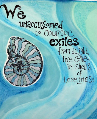
I really like the work of Maya Angelou, and this is a verse from my favourite poem of hers. There's something about writing out a poem or passage which means a lot to you, that allows you to dig even deeper into the words. That's what I was doing here .... I was thinking about the evocative phrase "coiled in shells of loneliness" and that made me get out this stamp; I've had it for ages and never get tired of the intricate shapes of the nautilus shell. Sort of proof of the existence of God, its so lovely.

This was also an opportunity to use my new(ish) metallic Promarkers. They worked beautifully here, although they're so opaque I had to be careful to work
between the stamped lines (done using Staz-On) because otherwise the metallics would have obliterated them. If you click on the photos they should enlarge for you, and then you might be able to see the metallic effect more clearly.
Then it was time for the ordinary Promarkers - I still use the spirit based ones and have yet to try out the Aquamarkers because I'm not convinced I NEED them (yet). I used the chisel end to create waves of colour across the page, and somehow these blue/green shades were just right, I can't actually explain why, they speak of the sea somehow ... well not the sea around these northern shores, more like the Mediterranean.

Then I took a couple of close-up pictures for you because a few people have mentioned my lettering and I wanted to show you how I do it, and how easy it is! First of all I write the letters very simply, allowing a lot of space, then I go back and thicken each letter, as you can see below, and once that's done I often add curly fanciful bits at the ends or feet of the letters - which are not only a mixture of upper and lower case, but all different heights and widths, so no need to worry about straight lines or anything!
The observant among you may also notice that I've used my Neocolour crayons on top of the Promarkers to add shading and depth - I love how you can build up layers of colour in this way, and often use them to deepen shades in parts of the page.
I hope you can see again here how the letters are gradually built up from the first thin lines I write? Its basically a kind of doodling really, and I'd suggest you get a rough notebook or piece of paper and just have a go for yourself. If I come up with a different way of doing a particular letter I always record it in my experiments notebook. I'd also advise that you study lettering wherever you see it - that's where I got the idea to make the L large with its foot going under the other letters. In the same way its fun to make the tail of a g or y curl around under the rest of the word. Look out for little bits and pieces and ideas you can use, and gradually you come up with a way of writing letters which is as individual as you are!

This is the final finished page - relatively unadorned for me, although I couldn't resist adding these other 'shells' (I think they're ammonites strictly) and was experimenting with some rather more delicate doodling than I usually do. Its just one of those times when less seemed to be more.

I'll try and show you some more lettering, if I can get around to making a tutorial of sorts - but in the meantime its useful to just practice whenever you can until it comes quite naturally, although I do find my hand gets awful cramp when I do a lot of it! Hope you like the poem - this verse is part of "A Brave and Startling Truth", and I just love it .....


