Showing posts with label Promarkers. Show all posts

Friday, 8 June 2012

ENOUGH ALREADY ....

This page began as one of the swirly layered backgrounds I make with my Caran d'Ache crayons, and the colour combination came about because of a fabric which caught my eye.  Funny where inspiration comes from isn't it?  I originally envisaged this as portrait (most of my pages are) but when I came to work on the page it just told me I had to use it sideways.  Well you know what I mean!  It began with this simple statement.

I make no bones about this being a "cri de coeur" because I can only journal about what's on my heart and mind, and right now there's only one thing filling all the space in my life - and that is whether we continue with my MIL living with us or take the next step into residential care. If I can't express my feelings honestly, however raw, in my journal then I'm doing it wrong!  I choose to publish much of it in the hope that my struggles might just illuminate someone else's path.

This whole issue is a minefield and a very steep learning curve - did you know that most care homes require top-up fees because the government will not pay enough to cover the true costs of care?   I know this decision is hard for everyone who goes through it, but right now I feel besieged and bewildered ... so obviously I journalled about it.  Having said that, there have been whole weeks lately when I haven't touched my journal at all ... and believe me that's VERY unusual, and a measure of my distress.
Then I added more writing (using a Purple Promarker and an extra fine nib) and some refinement of the colour layers using more Promarkers.  What I've written feels very defensive now I read it again, but I think thats an accurate reflection of where I'm at - our children aren't taking this well and as a result DH and I feel seriously unsupported.  Luckily we have friends who are with us in this journey.
Now you will recognise that this page is relatively simple and bare (for me that is) but that's because having spoken my truth there is no more to say.  Enough in fact.  Ah, but then comes my favourite part, which is adding all the doodly bits.  As ever the trusty white pen and more Promarkers feature heavily.

I'm pleased with this - it says everything I wanted to express, and reading it again reminds me that these are the important issues, almost everything else is relatively unimportant (as in what our children think about it all).  We are the ones at the coalface, so we are the ones who get to decide.  Sorry, don't mean to preach.  Good job God's still listening ..... she's good like that!

Saturday, 26 May 2012

RECORDING A DECISION ...

I actually made this page some time ago, but I looked at it again and thought how well it fits for NOW as well, as if subconsciously I knew there'd be a need - stranger things have happened! We've made the decision this week that its time for US, and after 15 years of caring for my mother in law we're looking at residential care for her.  This page kind of affirms that too somehow, although originally it was about time for myself and letting go of the things I didn't want in my life  ...
As you can see below I started as usual with my trusty Caran d'ache watercolour crayons, making a swirly background of blues with touches of green - actually my favourite colour combination, although pink and orange also lights my fire these days.  I wasn't all that keen on this background when I'd done it (am sure you know the feeling), but have learned by experience that you don't have to LIKE it at this stage- its a background, you're going to put stuff on top, it will work, wait till you've written on it!
You'll have seen me do this often - add wobbly lines that sort of creep into the page.  Not sure where I got this from (it might even be an original idea) but I do it often.  Here I used a green Promarker and a metallic one (you can see this better if you click on the picture to enlarge it).  Metallics with blue always seem to look great, reminds me of under the sea or something.  The panel on the right is one of my earliest pages photocopied and cut up - a technique I picked up somewhere ....my addled brain can't remember.
Funny how things work too - I didn't know when I added the picture of stripey legs/feet that it would spark off me writing something about standing on my own two feet, standing by a decision.  Serendipitous how things work out isn't it?
Lots of doodling to finish this off and fill in those pesky blank spaces that I can't seem to leave alone.  The doodle at top left was totally random at the time, but now I look at it again reminds me of a shell with complex chambers ... well you know what I mean, and I do know it looks a bit like a shuttlecock too!!  And yes of course, now that its finished I do like it, and the background seems just right, so trust yourself when you feel unsure about a page and wait and see how it all comes together.  If you still hate it when you're done you can always rip it out - and I have done occasionally.

Watch this space to see if we manage to hold fast to decisions made - not always easy, and it may take some time, but whatever happens I'm sure to make a page about it, after all this is my THERAPY!!

Friday, 27 April 2012

THE FIGHT AGAINST WORRY!

The challenge on Simon Says Stamp and Show was "one word", and I certainly knew what mine would be (see above).  OK so I sat myself down, delivered a good talking to and a stern reprimand, and ended up with a resolution to learn the lesson that worry is pointless.  If you can't change a situation all you can do is the best you can .... and that will have to be enough.  Right?  Anyway, of course I also journalled about it, as always, and sometimes I find the best thing to do when I need to get feelings down on paper is to start by writing the word you want to focus on in nice big letters on the page.  So I did, and then I coloured it a yummy shade of purple with my Promarkers.  At which point I felt better already!  Just acknowledging the problem (instead of incohate panicking) seems to work for me.
Then I used this Stampotique stamp of a frantic looking person to represent my frazzled self, and wrote down the key aspects of all this worry - the waste of time for starters!  Then as you can see below I wrote some more stuff, drew a few doodly flowers, and filled in the background with yet more Promarker.
At which point it looked sort of finished but then again not quite - so I went to down with the white and black pens, doodling away to my heart's content.  I can thoroughly recommend it as therapy for anxious persons - very calming!
So next time I post worried pages about this or that, you are at liberty to remind me of my promise to myself.  If God's in charge (and I really do hope and believe that she is) then its all in her hands anyway ..... and I just need to REMEMBER that!!

Sunday, 11 March 2012

A FAVOURITE POEM ...

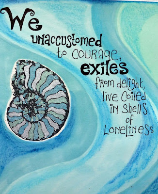
I really like the work of Maya Angelou, and this is a verse from my favourite poem of hers. There's something about writing out a poem or passage which means a lot to you, that allows you to dig even deeper into the words. That's what I was doing here .... I was thinking about the evocative phrase "coiled in shells of loneliness" and that made me get out this stamp; I've had it for ages and never get tired of the intricate shapes of the nautilus shell. Sort of proof of the existence of God, its so lovely.
This was also an opportunity to use my new(ish) metallic Promarkers. They worked beautifully here, although they're so opaque I had to be careful to work between the stamped lines (done using Staz-On) because otherwise the metallics would have obliterated them. If you click on the photos they should enlarge for you, and then you might be able to see the metallic effect more clearly.

Then it was time for the ordinary Promarkers - I still use the spirit based ones and have yet to try out the Aquamarkers because I'm not convinced I NEED them (yet). I used the chisel end to create waves of colour across the page, and somehow these blue/green shades were just right, I can't actually explain why, they speak of the sea somehow ... well not the sea around these northern shores, more like the Mediterranean.
Then I took a couple of close-up pictures for you because a few people have mentioned my lettering and I wanted to show you how I do it, and how easy it is! First of all I write the letters very simply, allowing a lot of space, then I go back and thicken each letter, as you can see below, and once that's done I often add curly fanciful bits at the ends or feet of the letters - which are not only a mixture of upper and lower case, but all different heights and widths, so no need to worry about straight lines or anything!

The observant among you may also notice that I've used my Neocolour crayons on top of the Promarkers to add shading and depth - I love how you can build up layers of colour in this way, and often use them to deepen shades in parts of the page.
I hope you can see again here how the letters are gradually built up from the first thin lines I write? Its basically a kind of doodling really, and I'd suggest you get a rough notebook or piece of paper and just have a go for yourself. If I come up with a different way of doing a particular letter I always record it in my experiments notebook. I'd also advise that you study lettering wherever you see it - that's where I got the idea to make the L large with its foot going under the other letters. In the same way its fun to make the tail of a g or y curl around under the rest of the word. Look out for little bits and pieces and ideas you can use, and gradually you come up with a way of writing letters which is as individual as you are!
This is the final finished page - relatively unadorned for me, although I couldn't resist adding these other 'shells' (I think they're ammonites strictly) and was experimenting with some rather more delicate doodling than I usually do. Its just one of those times when less seemed to be more.
I'll try and show you some more lettering, if I can get around to making a tutorial of sorts - but in the meantime its useful to just practice whenever you can until it comes quite naturally, although I do find my hand gets awful cramp when I do a lot of it! Hope you like the poem - this verse is part of "A Brave and Startling Truth", and I just love it .....

Friday, 24 February 2012

RAMBLINGS OF AN INSOMNIAC ....

I made this page in the middle of the night when I couldn't sleep ... and its interesting that in some ways its different to my usual output, not least in that its relatively simple. For once I haven't filled every nook and cranny with writing, but then it was about 3.00 am and even I can run out of words at that hour! You can see above how I began to lay down what I sometimes think of as a "river" of colour with the Caran d'Ache crayons ....
I took succeeding layers of colour out to the edges of the page, and then used a deep blue Promarker to define the edges (though not before I'd added some panels of offcut paper. Must have been in slightly mystical mode (I get like that sometimes) with the eyes and the buddha like figure.
And then, with uncharacteristic simplicty, I simply wrote down the central panel what I was thinking. Makes it sound easy doesn't it? It probably wasn't, but then who can remember what they got up to in the middle of the night? I was just pleased that it made reasonable sense when I got up the next day. I added some metallic lines using my new metallic Promarkers, but that was about all the embellishment I managed. I like it but there's no getting away from the fact that its a bit unusual for me! I wonder what that means? Never mind, its a mystery innit? Can't be profound all the time .....

Wednesday, 11 January 2012

THE GATE OF THE YEAR ...

This time I thought I'd show you a picture of my worktable as I began my page - the tin on the left contains my Caran d'Ache watersoluble crayons which I can't recommend highly enough. I only wish I could afford the giant set of 84 colours rather than the 30 this contains!! I've put it on my Amazon Wish List so you never know? This was the last page of my journal - rather appropriate since it was also 1st January - and you can see the door image by Paper Whimsy cut out and waiting on the right (couldn't find a gate). I'd already begun to rub the crayons over the page, leaving a gap for the picture - the colours kind of melt and change like magic when you work on them with a wet paintbrush.
You can see that here - you get a kind of watercolour effect, and I often go back in and add more, particularly around the corners and edges - the more you add the deeper the colour. I also begun to write out this lovely poem ... which I always think of as each year turns.
This is only the first section of it, but obviously all the verses wouldn't fit! I then went to town on the page in terms of doodling, decorating and generally filling up the space! If the bit at the bottom makes you think of a sunrise/sunset that's deliberate, because the remainder of the poem speaks about "the breaking of day in the lone East", and you do get these pinks and purples, particularly at dawn.
For the decoration around the door I was thinking about the infinity of days ahead, and all their possibilities (more journals to fill, more people to love) so I was trying to suggest that behind the door the horizon stretches away beyond our sight. Well I knew what I meant, and I do love just doodling away. This has all been done with a combination of black pen - I like the Pilot waterproof drawing pens in different nib sizes, white pen by Uniball Signo and definitely the best, and of course Promarkers. Happy New Year even if it is the 11th. (Already? How did that happen?)

Friday, 2 December 2011

FORCED SMILE

Wild horses wouldn't drag the truth out of me in terms of who I wrote this page about - too incriminating! However, am pleased to report that sloping off and writing this did increase my tolerance level, if only briefly.

More trusty Promarkers (you must be bored of hearing about them) so I won't go on about it. In a chicken or egg situation am not sure whether I've just found the confidence to draw more, or perhaps its that PMs so lend themselves to colouring that it naturally evolved. Anyway, working like this does seem to be a truly natural way of working for me ... and lately I'm feeling as if my journal pages are truly my own, and not just a sincere imitation of someone else's style.

But back to the subject .... my get out clause if challenged is that (obviously) this page isn't actually about me and my reactions, because the person in the picture doesn't look like me, not one bit. Or is that a psychological ploy on my part to distance myself from negative feelings? Who cares? The page was therapeutic and that's all I'm gonna admit to ...
Maybe everyone has moments like this ... tell me its not just me, please!! If I was really assertive I would be able to say calmly "please stop doing that, I find it very annoying" but I wasn't brought up that way. Don't let it stop you coming round - its not you, honest!!

PS Please tell me if you think this font is annoying - I rather liked it!

Tuesday, 22 November 2011

SIGNS OF OLD AGE ....

My name is Rosie, I'm 57 and a grandmother. There, I've said it. Lord knows how I got here ... time seemed to fly by (whether I was having fun or not) and now all of a sudden that middle aged woman I see in shop windows turns out to be me! How impossible that seems when, in my head, I'm in my early thirties. I've also noticed an increasing hardening of my attitudes (along with my arteries) that I'm not necessarily proud of, and do know that's something I have to work on. But equally there are some areas in which I've learned wisdom (I hope) and maybe these are some of them, or possibly I'm just growing old and lazy? You decide!
This page began with me writing the title, and then I just started to doodle the borders. The next stage was to list some of the things I saw happening in me, and to begin adding colour - once again the trusty Promarkers came to hand! I do love what I can do with these, and how vivid the results are. If you look closely you can see some of the shading I've achieved (although I have a lot to learn on that front) often just by adding a light grey OVER the colour. That's what gave me the grape shade around the black on the pink/purple panel at the top of the page, which was the effect of grey over the pink.
I'm still not entirely comfortable with too much white background, so then I began to add a colour around the writing - if I go over the writing I find it fuzzes a bit even though the waterproof ink doesn't actually run. Doodling away in colour on the borders was such fun - really relaxing and reflective!
And this is how the page finished up - it seems a shame now that its just a list, I might have written it more artistically, but I didn't. That's partly because when I began it I didn't actually know what would be on it! It may be that you recognise some of the symptoms I describe ... in which case welcome to the club! I've just noticed that some of the branches I've drawn look a bit like arteries ... but suspect that was subconscious.
Now I'd better go off and do some work on not being quite such a cranky old lady - or my grand-daughters will find me very boring indeed, and that would never do!!

Thursday, 17 November 2011

HAPPINESS ... or the lack of it.

Ever had one of those times when you woke up in the morning and suddenly the world had gone all grey? Yep, it was one of those. I did the usual cheering self up stuff - chocolate, counting my blessings etc, but the outlook remained resolutely cloudy, so I turned to my journal instead.
It's interesting that I actually journalled about my glum feelings in wonderfully bright colours isn't it? Not sure what was going on in my brain there. Anyway, this is pretty much all Promarkers again, except for the background around the writing, which was done with my trusty water soluble crayons.
Anyway, not much to say about this really - I guess it speaks for itself? It hasn't been a good week - haven't been sleeping, life seems pointless etc etc, you know how it is. This too shall pass.

Tuesday, 2 August 2011

OH GOOD GRIEF ....!

This was a very heartfelt page made after my beloved had had to cut up my food for me! I admit it, I panicked a bit ....! It's hard not to mind about increasingly losing your independence, but I managed to laugh about it eventually, and making this helped. I'm rather pleased with it as another step in my progress as a Promarker user, as I learn how to combine colours and do shading.
But it started like this - inspired by some work I saw in Stampington's Art Journalling magazine. As before, the work is prepared in black and white and only then is colour added. It's something that doesn't quite come naturally, but I have been pleased with the experiments I've undertaken so far. As you can see below, I didn't complete the whole page without colour, but added it here and there as I went along.
Its funny but colouring around the journalling and drawn shapes is actually easier, so this might be the way I'm going to go. Working like this and developing my drawing skills seems to be pressing my buttons anyway, and I'm thoroughly enjoying it!
And this is the finished result - it seems to work really well leaving some white space around things, which is just as well because the pens do bleed somewhat on this watercolour paper. They come through to the other side as well, but that's OK because I always glue two sheets together to make a thicker base to work on. Even then it can still come through a bit, but I've learned the hard way what techniques will and won't work on the reverse of one of these.
I'm looking forward to doing more pages like this anyway. Does anybody know of any Promarker tutorials or classes you can go to - there must be so much I need to learn about these.

Thursday, 7 July 2011

MORE PAGES

While I was having trouble getting pictures to upload to my computer, I did a few pages without taking stage photographs. The one above has a Distress ink background and used all kinds of collagey bits, including some washi tapes that I'm learning to love. Actually this might even be a Tim Holtz tape ... I've got both.

The page below uses a soluble crayon background, done in the layers I'm so fond of (I've done a number of pages like this). It all began with that coloured snippet which says "tomorrow" and went from there ....
Lots of Promarkers used here - I'm really getting to like these and find them very versatile. The fact that they tend to bleed through paper isn't a problem because I always stick two pages together anyway.

Sunday, 17 October 2010

DRAWING THE PSALMS ...

On my earlier post about my "peaceful" page somebody commented that I was taking a lot on, trying to draw pictures of God! This made me think of that joke about a little girl doing a drawing whose mother told her that nobody knew what God looked like. Her answer was that they would when she'd finished her picture!!

So lest you think that I'm creating graven images and whathave you ... I was actually thinking here about a modern psalm which is one of my favourites, and it begins "I will praise God my beloved for she is altogether lovely". What I was trying to encapsulate was the "altogether lovely" part, I suppose. As you can see above I started with some simple pencil lines, and then below got to work with my promarkers. I'm not very good at the fancy shading with these, but do enjoy using them.
Kept adding more colour, but somehow it wasn't quite right.
So I left it to come back to another time, at which point I coloured the background navy blue, and that's when this page really took off! Unfortunately I was so absorbed in the process that I forgot to take stage pictures, so this is the final result. The photos don't show it very well, but I used lots of gold and silver on this, and in fact all the writing (lines from the psalm) is in gold, and she had threads of both colours woven through her hair.

At the very end I still felt it needed something, so I masked off her face before spraying the whole page with a glimmery gold dust effect. Unfortunately this doesn't photograph very well, but in real life it seems to give the inner glow effect I was after. This is one of my favourite pages so far - actually deceptively simple, but speaking of something which goes deep for me .... I hope you agree that she is altogether lovely!