Saturday 30 July 2011

A BIT RANDOM REALLY ...

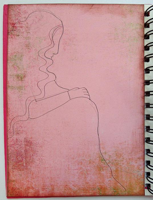
If this page looks a bit different that's because it IS. I was having a go at a new way of doing things and the result is a bit random but I might well do it again ....
Looking at someone else's journal (duh, I forget whose) I realised that they began with all the writing and drawing FIRST, and then laid down colours around this. It made perfect sense except that that's not how I've ever done it. So I thought I would have a go and the above is the beginning of the process.
Then as you can see above I put some basic colours on the page using my Caran d'ache watersoluble crayons. It did feel very odd to be working around my drawings and at first I tried to do that colouring within the lines thing, before realising that I really didn't HAVE to, and in fact it looked better with some white space.
And of course I couldn't be doing with the empty bits in the middle so inevitably added some more stuff, although you can see that what I've written is more about what I was doing than a deep reflection on the meaning of life! Both are legit as far as I'm concerned!
And it was pretty much inevitable that I finished up filling every available inch of space, in my usual fashion. I rather like how wild and colourful it turned out, so this experiment did encourage me to work beyond my usual tidy boundaries! It was odd to work in what is, for me, the reverse way of doing things - I usually lay down a background colour first - but I did enjoy it. I can see that working this way gives me a lot of control over the relationship between what I write or draw and the colours around that, so I'll probably use both techniques in future.

Sunday 24 July 2011

MUSINGS ABOUT HOME ...

This page began in my head when I was in the middle of writing a sermon, and had turned to my journal for rest and distraction. The text for that day had to do with the stranger and the alien, which got me thinking about home ...

I used a page I had previously prepared with a Distress Ink background, adding Promarker and fine black pen doodles, and something which made me think of the roof of a house. I got this far and still having the sermon themes in my head, realised that home is nothing to do with houses, or indeed bricks or mortar at all! That's when I wrote ... "where can I go from your presence".
So that's what the page turned out to be about - which wasn't what I'd intended, but it often works out that way ... so I added a lot more reflection around the ideas uppermost in my mind. I was also thinking about those words which describe God as a "strong tower", so that's why my house has bricks (I think that comes from a hymn, but can't remember).
However, lest you think me very holy indeed (as if) I'm bound to admit that the reason I write all this stuff down is because I often forget these truths, and need to be reminded of them! If I could always remember them I probably wouldn't need to journal at all!!

Thursday 21 July 2011

SCARY DEMONS

We all have scary demons that keep us awake nights - right? Well lucky you if you don't, but I do! But I have found that from childhood monsters upwards, things are more frightening when you allow them to grow and become huge in the dark. So my policy has been to bring fears into the light and take a long hard look at them. Somehow they are almost always less scary when you do this, and just occasionally they disappear. That's what I was trying to write about here.

I was also trying to be more adventurous with colour sprays, but ended up with a background that was truly vivid but a bit dark for writing on!
This page makes me smile whenever I look at it. I don't think of myself as brave - I'm prey to all kinds of fears and worries, as we all are. But I do try to overcome these things. It even works sometimes ....

Sunday 17 July 2011

IMITATION IS THE SINCEREST .....

I've been poring over the latest edition of the Somerset Art Journalling magazine - so full of inspiration you hardly know where to start! Anyway, I wanted to challenge myself to try some new things, or techniques I hardly ever use. I took inspiration from Joanne Sharpe and her use of black line on sections of vivid colour.

But first I did this ..... I stuck down a sheet of torn text, then gessoed over it , before adding patches of paint colour. I knew I'd want to draw around the colour panels so thought about the shapes I was laying down. Some of the colours were deeper than I really wanted, so I experimented with lifting some of it off, sort of blotting it with a baby wipe. It seemed to work.
Then I set to with a really fine pen to doodle around - this part was fun! I am conscious that this owes a lot to Joanne's style, but I like this technique and hope to make it my own on future pages.
And this is what I finished up with - rather more space than I usually leave, but that's what Joanne's pages are like and I wanted to make myself do it! It was a struggle but ....
While I like the finished result it isn't quite "me" somehow, but I learned a lot doing it that I'm sure I'll take on into future pages. That's the whole point of trying out something new isn't it, and why I never ever mind if people are inspired to use my pages in their own journals - we all take from one another and a variety of sources don't we? Still, if you do, a mention is always nice ....

By the way - thank you so much to all of you who responded to my last post! You've let me know that what I always hoped is true - that the things I do in my journals resonate for you also, both the ideas I write about and sometimes the techniques I use. If I am ever able to inspire or encourage someone else's art journey, that's what I do it for.

Wednesday 13 July 2011

I'M SO PLEASED WITH THIS ONE

Well I probably shouldn't say that (blowing one's own trumpet being generally frowned upon) but I AM pleased with this - which turned out exactly as I wanted it to. Can't say that very often!! A couple of weeks ago I wrote this "psalm" and wanted to include it in my current journal. I knew that (unusually for me) I'd need to do a double page spread, so began with this Basic Gray paper as a background. Being so focused on the motherhood of God idea, I wanted to express that visually, so began to sketch a pregnant mother ....
Then I started to give her some colour and (I hope) personality. I used my Promarkers here - I'm loving them more and more as I slowly learn how to use them to best effect, and must also say that they're wonderfully fast. Now that might not be an important attribute to everyone, but to someone with a sieve brain such as myself it means I don't forget where I was trying to go while I'm doing it!
The next stage was to write out the words and gradually add more decoration. The gold pen I used here seems to add a whole new dimension, and I used some more of that fine gold mist too but you can't see that here - it gives the figure a very slightly twinkly look.
Then it was time to start working on the other side - again by writing out the verses, and I knew I wouldn't have room for much more illustration. Focusing on the words allowed me to see how much space would be left for decoration, and once I'd drawn the leaves and flower I went back and added some of these to the left hand side to link it all together.
And this is the finished product, and as I said for once I'm very pleased with it. Some days I like what I've done, and others I don't, but then just occasionally I pull off something I didn't think I could do .... and this is one of them.
You may of course be happy with the image of God as Father, and the idea of mother might seem positively alien? Both are entirely legitimate, since God is neither male nor female, but we can find understandings of God's nature in the best of human nature and experience, whether of men or women. There is a redemptive aspect too for me in a motherly God, since my own mother was pretty deficient in that direction ....

Please tell me if you like it, or how you respond (or not). So many of you follow but so few comment, and sometimes its just nice to hear from you and remember that you're out there! I'm grateful for all feedback.

Sunday 10 July 2011

NOSTALGIA .....?

My Dad is presently in hospital north of here, and his flat is all of 50 yards from the house where I grew up! Going there has meant travelling a lot of old roads familiar from childhood - everything looks so much smaller now, and of course some things are gone or irrevocably changed. Don't get me wrong, about the only thing I liked seeing again in this run down beach resort was the sea - watching the tide again caught me unexpectedly and powerfully in a place I didn't know I'd missed. This page is the result ....
I began with a water spattered Distress Ink page which made me think of a big sky, and bordered it with strips from my home-made collage sheet (made from patterns cut out of a house magazine for those who missed it). There was much about the town that was, as ever, a little bit lurid and gaudy, and these bright colours caught something of that. Most of my pages begin with a word or short sentence, and that's what happened here.
And then my nostalgic mood deepened into other regrets ... that in 36 years of marriage we have spent only the first four by ourselves, and have had a parent living with us since before our girls began to leave home. I feel guilty about it, but we do find ourselves longing for a time when it will be just the two of us ... and a lot quieter than it is at present. Maybe you have to acknowledge such feelings now and again, before you can tuck them away again and get on with dealing with reality?
So it turned out to be all about space and light, both physically as well as with and for our souls. Strange isn't it, how this deep longing welled up in me and found expression here? That's one reason why I love art journalling so much - its often a healing process of working through things, and sometimes, as here, you sit down to do one kind of page and end up with something quite different which needed to be looked at and acknowledged.

And right now, yet another parent needs my time and (limited) energy, so it all has to go back in the box, though maybe, just maybe, there's a little less of it than there was to cram back in .... and one day, soon, we're going to take off for the coast and find something there for a few hours that I now know I need.

Thursday 7 July 2011

MORE PAGES

While I was having trouble getting pictures to upload to my computer, I did a few pages without taking stage photographs. The one above has a Distress ink background and used all kinds of collagey bits, including some washi tapes that I'm learning to love. Actually this might even be a Tim Holtz tape ... I've got both.

The page below uses a soluble crayon background, done in the layers I'm so fond of (I've done a number of pages like this). It all began with that coloured snippet which says "tomorrow" and went from there ....
Lots of Promarkers used here - I'm really getting to like these and find them very versatile. The fact that they tend to bleed through paper isn't a problem because I always stick two pages together anyway.

Sunday 3 July 2011

PEACE COMES DROPPING SLOW ...

A very talented blog-friend, Jackie Cardy, is sort of responsible for this page. Do visit her blog to see the amazing felt and embroidery pieces she creates. One of her recent ones was on the theme of Peace Comes Dropping slow ... and after she mentioned it I couldn't get the phrase out of my mind. Its from a poem by Yeats "The Lake Isle of Innisfree", and I've always loved it. This is the middle
verse ...
And I shall have some peace there, for peace comes dropping slow,
Dropping from the veils of the morning to where the cricket sings;
There midnight's all a-glimmer, and noon a purple glow,
And evening full of the linnet's wings.
Anyway, this was a page I'd already prepared and the pinky purples seemed just right for the "veils of morning". The background is done with my trusty Caran D'Ache crayons and I added the flower with Promarkers, which to my delight take really well on this surface. I'm using these quite a lot now, and apart from the smell really like them!
With no particular plan in mind I just began to write the poem out - wish I could do beautiful calligraphy which would do the words justice - and generally just doodling around the spaces. Working on this took me to a wonderfully peaceful place which felt like a gift and a blessing.
The leaves were also inspired by Jackie - because her pieces are composed of leaf shapes, and that seems right somehow. The vision of peace seems to go with the idea of gently dropping leaves, and things in their due time and season - very much on my mind at the moment.
I'm more pleased with this page than I have been with any for some time - it somehow catches what the poem was saying to me, and it will be good to revisit this when I'm feeling rather less than calm and serene....

So thank you Jackie for your continuing inspiration - isn't it wonderful how artists can touch one another and bring out things you never knew were in you??