If you follow my blog you'll know that I've been battling my way through all sorts of setbacks, large and small, lately, and I made this page at a time when I'd decided that all I could do was rest in the promises that (in the end) all will be well. When you can't change something, not even by worrying about it, you just have to let it go, right?
So that's what I was trying to do here, and thinking about the words in Psalm 131. I think of God as a mother a lot, and so I drew this image of the child on its mother's breast and I wanted both her face and the child's to be very serene. The baby might be me, but it could just as easily be you ... it works as an image and metaphor whatever, doesn't it?
Then I started to write out the quote - feeling my way with this style of lettering which borrows heavily from Teesha Moore, but has sort of morphed gradually into my own (I hope). I drew lines first but ended up making the letters of different heights, so they were just there as a guide and I rubbed them out later. Out with the trusty Promarkers and I began to colour the lady - choosing this restful grey-blue.
Then it was finishing the lettering, adding the background colour, and lots of doodling. And of course there had to be elements of gold pen too - I know I've spoken before of the golden thread which runs through everything, so it had to be here. By the time this page was finished I was indeed calmed and comforted, ready to trust in whatever the future holds. Whatever would I do without the therapeutic opportunities of journalling to work things out in this way ..... ?
Pages
▼
Saturday, 28 January 2012
Monday, 23 January 2012
FEELING UNSURE
This page began without any real idea of what I wanted to say - just working on a background using yellow crayon with touches of grey as shading. I didn't take the colour all the way to the edge, and made a see through border using this Tim Holtz tissue tape, slightly fragile stuff I found but I really like the transparent look it gives. The words about journal just seemed to belong really. And that was it until I found the word "feeling" on one of my collage sheets, which made me ask the question ... well what am I feeling? After that I was off, as you can see below, and because it was all about uncertainty and not being sure what to do next I used grey (Promarker) as a way to visually illustrate that ....
And then it was one of those times when the page was just - finished, with nothing more to say, but of course being me I couldn't leave all that blank background, and my usual doodling and drawing wouldn't have seemed right for the subject matter. So out with my trusty dotty stamp and hey presto, empty spaces gone and filled with curvy lines that also add to the sense of wavering uncertainty!
I really like this page - its a bit different from my usual style, which can only be a good thing. Its always an interesting exercise to work outside your comfort zone. Unfortunately the answer to my question is no nearer than when I began, but I'm sure it will reveal itself when the time is right.
Thursday, 19 January 2012
SORRY I WAS AWOL THERE ....
My computer was having a funny turn and had to go and be mended. I'm embarrassed to admit how much I missed it and the online community which brings the world to me ... my life as a disabled person who has to stay home and sit down a lot would be so much worse without that window on the world.
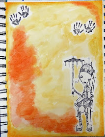
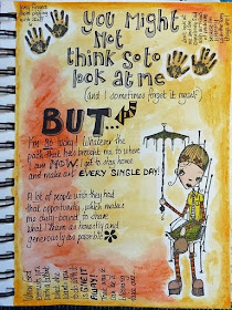
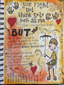
Anyway, hopefully all is now fixed and Polly PC will henceforth run beautifully. The enforced idleness from cruising the internet actually resulted in a great outpouring of stuff into my journal - it can only be good to get it off your chest right? Anyway I began this on a day when I was seriously having to take my own advice about counting my blessings, or fall into that dark hole where we all go sometimes. With that in mind I got out my watercolour crayons and splashed about in the brightest colours I could think of. Lots of people ask if I know what I'm going to say when I begin and the answer is 'sometimes', but not on this occasion. I added the Stampotique girl to represent me - she makes me laugh, she has to sit down, I also wear shoes with very thick soles or my feet hurt too much, and the brolly is an inadequate defence against the things which not infrequently drop on her . The handprints are there to represent the way I'm always getting sticky with arty stuff!
And then of course I knew what I wanted/needed to say, and the writing just flowed. I HAD forgotten that I'm lucky to have time and space to make art, and do need to be reminded frequently. I suppose its about not letting the bad stuff drag you down to a place where you can't see the bright seam of gold which runs through and illuminates your days? I know, I sound like Pollyanna don't I? I'll be doing that "Jesus wants me for a sunbeam" thing any minute ...
And having reminded myself of all the seriously Good Stuff in my life, there were still rather too many blank bits for my liking (I do prefer to make really BUSY pages, FULL of life and colour).
So I filled some of them up with doodles and drawings and this brilliant curly/dotty stamp which I absolutely love, use all the time, and have had so long that I can't remember where it came from. No actually I can - its from a clear set by Impression Obsession and its called Spring Squares. I've never actually used any of the square stamps in the set - though looking at them now I wonder why - but this curly one has been so useful.
Which brings me to wondering .... if I designed some stamps specifically for art journallers which like this were just elements you could use anywhere on a page, do you think there would be a market for them? It's something I'd LOVE to do ...
Wednesday, 11 January 2012
THE GATE OF THE YEAR ...
This time I thought I'd show you a picture of my worktable as I began my page - the tin on the left contains my Caran d'Ache watersoluble crayons which I can't recommend highly enough. I only wish I could afford the giant set of 84 colours rather than the 30 this contains!! I've put it on my Amazon Wish List so you never know? This was the last page of my journal - rather appropriate since it was also 1st January - and you can see the door image by Paper Whimsy cut out and waiting on the right (couldn't find a gate). I'd already begun to rub the crayons over the page, leaving a gap for the picture - the colours kind of melt and change like magic when you work on them with a wet paintbrush.
You can see that here - you get a kind of watercolour effect, and I often go back in and add more, particularly around the corners and edges - the more you add the deeper the colour. I also begun to write out this lovely poem ... which I always think of as each year turns.
This is only the first section of it, but obviously all the verses wouldn't fit! I then went to town on the page in terms of doodling, decorating and generally filling up the space! If the bit at the bottom makes you think of a sunrise/sunset that's deliberate, because the remainder of the poem speaks about "the breaking of day in the lone East", and you do get these pinks and purples, particularly at dawn.
For the decoration around the door I was thinking about the infinity of days ahead, and all their possibilities (more journals to fill, more people to love) so I was trying to suggest that behind the door the horizon stretches away beyond our sight. Well I knew what I meant, and I do love just doodling away. This has all been done with a combination of black pen - I like the Pilot waterproof drawing pens in different nib sizes, white pen by Uniball Signo and definitely the best, and of course Promarkers. Happy New Year even if it is the 11th. (Already? How did that happen?)
Friday, 6 January 2012
ANGELS
You may think I've lost the plot (and I'm not saying you're wrong either!) but on a very few occasions in my life a messenger I believe to be sent from God has come to me ... and because of that I like to think of them angels. I was blessed by such a visit a few weeks ago ... and this is my attempt to capture what I felt.
The background is mainly rubbed on Distress Inks, splashed with water, and I used my water soluble crayons to add a bit of depth to the colour around the edges. Although I don't subscribe to the idea that angels are girls - the biblical ones have names like Gabriel and Raphael - the Messenger who came to me that day was female, so I chose this image because I've always liked the serenity of this young lady's face. The wings themselves are gold foil bought ages ago - Paper Artsy keep these, and I think they're called German scrap, or something like that?
So then I just journalled straight onto the page - for once it was difficult to know quite where to start, so I pulled words out of a collage sheet of phrases that just seemed right, and worked around them. I almost decided that it was finished once the writing was done, but you know me and blank backgrounds - I just can't leave them alone.
I've recently discovered the joys of adding a little bit of metallic gold or silver to a page, and because what I was trying to record was so special it felt like gold was called for, so I drew a gold vine using a spirit based pen. Stinky, and the fumes may have made me a bit dizzy, but I do love the result. It still feels strange looking back at this experience, and I'm not sure that I've fully unpacked its implications .... but am working on it!
Sunday, 1 January 2012
LAUGH ... its another Year!
I came across this quotation and thought it hit the spot for how I was feeling ... so this page began in a slightly unusual way for me. I'd done some work on the reverse and my Promarkers had bled through - they only do so occasionally since I glue two pages together, and then usually only if there's a big, dense block of colour. That's why the background here is an offcut of scrapbook paper to which I've added a section from a Teesha Moore collage sheet. Initially I just threw the cut up words down onto the page - I might have wanted to re-arrange them, who knows? But as you can see below, I put them down in the order intended, with another piece of collage.
Then it was one of those times when I got absorbed in the work and forgot to take more photos until the end. The window is from a Paper Whimsy collage sheet, and the lady is the Artchix muse - I use her a LOT, I just love the quizzical look on her face! The window image sort of represents the fact that I seem to spend a lot of my life on the inside looking out ....
It was pretty much finished at that point but the big orange areas looked a bit blank, and although I didn't want to fill it with writing (in my usual fashion) I drew a sort of vine in the spaces. It seemed to belong because it represents the tangle that my life is in at the moment ... just when it seemed to be safe to go back in the water. Never mind eh, you've got to laugh right?
HAPPY NEW YEAR TO YOU ALL and remember to keep right on journalling the ups and downs of life - after all its cheaper than therapy (and I KNOW because I've done both)!